-
Shop
- Advanced Technologies
- AI Career Advantage Collection
- AI Skills Mastery 2026 Collection
- Arts, Crafts & Hobbies
- Bathroom
- Best-Sellers
- Car Accessories
- Dating & Social Skills
- Denim
- 7FOR
- AGOLDE
- Antony Morato
- Armani Exchange
- Boss
- Brunello Cucinelli
- Calvin Klein Jeans
- Costume National
- Desigual
- Diesel
- Dolce & Gabbana
- Dsquared²
- Ermanno Scervino
- Fendi
- Gianni Lupo
- Guess Jeans
- Ichi
- Just Cavalli
- Lee
- Levi's
- Liu Jo
- Morgan De Toi
- Mother Denim
- Only
- Pepe Jeans
- Pinko
- Replay
- Valentino
- Vero Moda
- Digital Resources
- Education & Learning
- Family & Parenting
- Fashion
- Furniture
- Gadgets
- Health & Beauty
- Health & Wellness
- Home & Garden
- Kids & Babies
- Kitchen
- Lighting
- Patio, Lawn & Garden
- Personal Growth
- Pet Care
- Pet Supplies
- Pets
- Sport & Outdoors
- TikTok Growth & Monetization Mastery
- Travel
- Wealth
- Popular
- Best deals
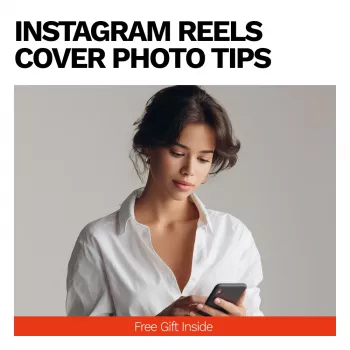
Instagram Reels Cover Photos: Clear, Consistent Branding

Reels Cover Photos That Look Consistent, Clear, and On-Brand
A strong Reels cover photo helps a profile grid feel intentional, makes a Reel understandable at a glance, and supports consistent brand recognition. The best covers do three things well: they communicate fast, stay readable at thumbnail size, and look like they belong to the same “family” across your account. Below are practical design rules, safe cropping guidance, typography tips, and a repeatable checklist you can apply whether you’re a creator, a service provider, or a product-based business. For more guidance, see Do Reels Covers Matter? Here’s the Truth — and free Canva ….
What a Reels cover needs to do (in 2 seconds)
When someone lands on your profile, they’re scanning—not studying. Your cover has a tiny window to earn the tap. For further reading, see Should Content Creators Care About Instagram Reel Covers?.
- Communicate the topic instantly with one clear focal point: a face, a product, a result, or a bold headline.
- Stay legible at small sizes on the grid. Thin fonts and low-contrast color combos fade fast.
- Match your visual style so the grid looks cohesive (consistent color, type, spacing, and photo treatment).
- Create curiosity without being vague; the viewer should understand the benefit or outcome.
- Avoid clutter: one message, one hierarchy, one main promise.
Sizing, cropping, and safe zones (so nothing gets cut off)
Even if your cover looks perfect in a vertical layout, the profile grid preview can crop it differently. Design with “safe zones” so the most important details survive every placement.
- Design vertically first, then confirm how it appears as a grid thumbnail preview.
- Keep key text and faces centered; edges are the first to get trimmed across placements.
- Use generous margins around headline text—avoid placing critical words near the very top or bottom.
- Check multiple screens (phone and desktop) to verify readability and cropping behavior.
- If you use a logo, keep it small and place it consistently (a single corner placement is usually easiest to standardize).
For platform-specific guidance, Instagram’s own documentation is the safest reference point: Instagram Help Center and Meta Business Help Center.
A simple template system for consistent branding
Consistency doesn’t require fancy design software—just a few decisions you repeat on purpose.
- Choose 1–2 brand fonts and commit to them. Use a bold weight for headlines and a clean secondary style for small labels.
- Keep a tight color palette: one dominant background color, one accent color, and one neutral for text.
- Define three repeatable cover types (for example: tutorial, behind-the-scenes, product demo) and add subtle cues like a badge, border, or tag.
- Standardize headline format: short, benefit-led phrases (3–6 words) beat long sentences.
- Use one photo treatment (natural, warm, high-contrast, etc.) so mixed content still looks unified.
If you want structured, plug-and-play guidance that includes a thumbnail checklist, see Instagram Reels Cover Photo Tips | Instagram Reel Cover Guide, Reels Thumbnail Checklist, Social Media Branding eBook for Creators & Businesses.
Text and typography rules that stay readable
Great cover text is designed for the grid, not for a full-screen view. Treat it like signage: bold, short, and high-contrast.
- Use high contrast (light on dark or dark on light). Mid-tone text on mid-tone backgrounds disappears.
- Avoid all-caps for long phrases; it slows readability when the thumbnail is small.
- Make the first 2–3 words dominant. If the rest can’t fit clearly, cut it.
- Prefer bold weights and thick strokes; thin serifs often blur on mobile.
- Add subtle separation (shadow, gradient, or a solid text block) when the background has detail.
For quick design fundamentals you can apply to cover layouts, Canva Design School is a solid refresher on hierarchy, contrast, and spacing.
Choosing the right image (faces, products, and motion cues)
Your image should do the heavy lifting before anyone reads. A strong subject and clean framing make the cover feel “premium” even with simple text.
For creators who want to feel more confident on camera (which can improve face-led covers and on-screen presence), consider Body Confidence Blueprint | Ebook Guide on How to Build Body Confidence, Self-Image & Everyday Confidence.
Thumbnail checklist for a quick quality pass
Reels cover checklist
| Check | What to look for | Quick fix |
|---|---|---|
| Clarity | One topic and one focal point | Remove extra elements and tighten the crop |
| Readability | Headline readable at small size | Increase font weight/size and contrast |
| Safe margins | No critical text near edges | Center key text and add padding |
| Brand consistency | Colors/fonts match other covers | Apply the same palette and type styles |
| Image quality | Sharp subject, not pixelated | Use a higher-res image and avoid over-zooming |
| Hierarchy | Primary words stand out first | Make the first words larger; reduce secondary text |
| Mobile test | Looks good on phone grid preview | Adjust scale and spacing after a quick preview |
A repeatable workflow for batching covers in under an hour
Common mistakes that make covers look unprofessional
When a guide helps most
FAQ
Should Reels covers include text?
Text helps when it stays short and high-contrast. Keep headlines to a few words, prioritize readability on the grid, and avoid placing critical words near the edges where cropping can happen.
Why does my cover look cropped differently on the grid?
Different placements show different crops, especially between the full Reel view and the profile grid preview. Keep key elements centered, leave generous margins, and preview on mobile before publishing.
How often should covers be updated?
Update covers when your brand fonts/colors change, when older covers look inconsistent, or when a series needs clearer labeling. Batching updates for your top-performing Reels is usually the most efficient approach.
Recommended for you


Retro Brass Kitchen Faucet: Gold Finish, Modern Fit
Jun 24, 2026


Leave a comment